
Margaret Hoang
Building up humans and tearing down tech barriers through UX design.

Interaction Design & Leadership

Journey Mapping

Mobile Design

Mentorship
Interaction Design & Leadership
Crafting signup & setup for a customer segment
I advocated for and designed a major upgrade to Covenant Eyes's signup & setup flow. This addressed an outstanding UX issue for couples and families looking to protect their loved ones from online addiction.


Project
Role: Project lead, designer
Skills: Stakeholder engagement, project planning, wireframing, interaction design, usability testing
Tools: Miro, Figma
Duration: 8 months
Highlights & Outcomes
Reduced related support calls by 44%
Innovated by adding an installation checker
Simplified account setup to 3 steps
Fostered a stronger collaboration between Product and Marketing
Journey Mapping
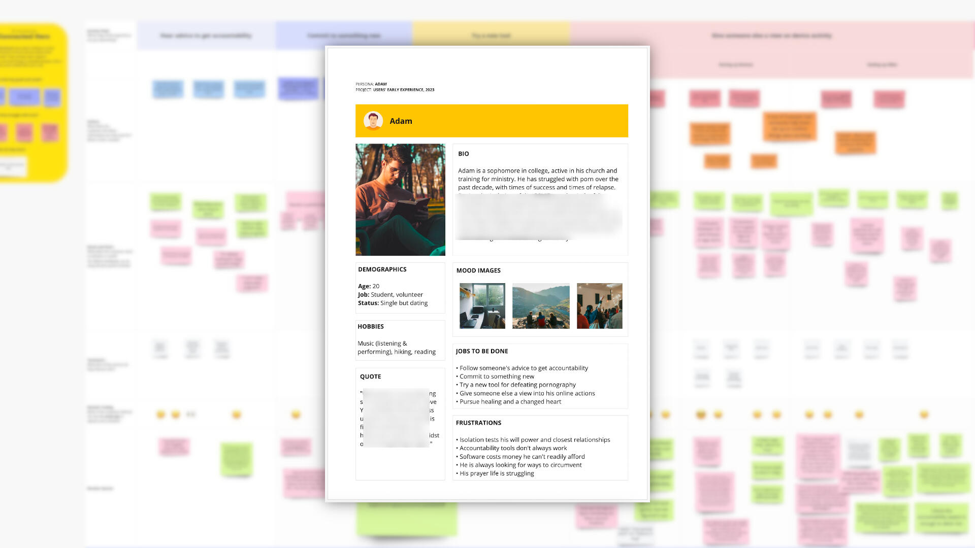
Understanding new users, from product discovery to installation
I led a multi-phase research project to discover what led Christians to seek help for their porn addiction and what was their early experience with Covenant Eyes's accountability software. This yielded data-driven evidence for several major enhancements to the product.
Project
Role: Lead researcher
Skills: User interviews, customer journey mapping, service blueprinting, persona creation
Tools: Miro, Condens
Duration: 3 months
Highlights & Outcomes
Identified Jobs-to-be-Done, Pains, Gains, and Opportunities in the signup and setup flows
Synthesized internal and external interview data for a holistic view
Advocated for UX improvements using research artifacts
Mentored a colleague by collaborating on a service blueprint
Coming soon: Deep dive...
Mobile Design
Revamping an Android app for Covenant Eyes
Covenant Eyes helps Christians reflect on their online activity and stay safe from explicit content. I redesigned their Android app for a cleaner UI and smoother UX.


Project
Role: Designer
Skills: UI design, interaction design
Tools: Figma, Material Design
Duration: 2 months for design, 4 months for development support
Highlights & Outcomes
Designed an engaging, friendly UI aligning with current brand standards
Crafted intuitive, Google-like interactions with better visibility of system status
Collaborated with developers to improve layout responsiveness
Mentorship
Pursuing professional growth together
Mentorship has been a joy of mine from the very beginning. My experience includes:
Managing a databases workshop for university students
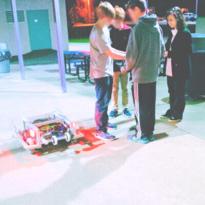
Introducing Java to a high-school robotics club
Hiring and training software developers in frontend development, databases, and DevOps
Teaching colleagues in other fields about UX design and research
Leading a weekly educational series on design
Giving ad-hoc reviews of resumes, portfolios, and academic essays
My approach centers around providing hands-on experience in a hands-off way, as well as learning new things together. I constantly seek opportunities for my mentees, equip them with relevant knowledge, and help them grow in self-confidence and autonomy.
Fun stuff
Coming soon :)
About me
A product designer with roots in dev
I love solving UX problems, big or small. I believe our best work is done when collaborating across teams and testing designs with real users. I thrive in the strategy, structure, and interaction layers of design. My previous career as a full-stack engineer has given me insight on the software lifecycle and how to collaborate well with developers.

A life in the woods
I grew up in the greater Seattle area and now live in the UK with my husband. I enjoy books, music, and all kinds of tea. My last name is pronounced like hwong. :)